The 5 Must-Have Elements on Your Webinar Registration Page

Getting people into your sales funnel is key — it’s how you’ll make money in your business! Once someone enters your funnel, they’re in your inner circle where you can serve them and offer them your latest products or services.
So, how do you get them into your funnel? There are a few ways, but one of our favorites is with webinars.
A webinar is a great way to serve your audience some valuable information and then introduce them to everything else you have to offer.
In order to have a registration page that fills up your webinar fast, there are 5 elements to include.
The 5 things that you must include on your webinar registration page:
Number One: An Exciting Title
If you want people to stick around and sign up for your webinar, hook them with the title. It should describe what the webinar does in a concise, snappy way. Tell people what problem you’re solving for them.
One of our customers, Laylee Emadi, has an excellent registration page for her free masterclass for creative educators.
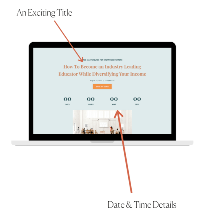
Number Two: Date & Time Details
Make sure the webinar date(s) and time(s) are made super clear. People won’t sign up if they don’t know when it is. It’s best to offer multiple dates and times so that more people can show up live! Bonus points if you have an “Add to Calendar ” button so people can add it right to their schedule.
In Laylee’s example above, you can see she has the date and time right up top. She even has a countdown timer to create some urgency!
Number Three: Clear Calls to Action
Put at least one button on your webinar registration page that clearly invites people to sign up. Use direct phrases like, “Sign me up” instead of, “Tell me more” to inspire registrations.
On Laylee’s webinar registration page, she includes three separate call to action buttons, each with different wording to make sure she grabs everyone’s attention. Notice they’re in a different color and totally pop!
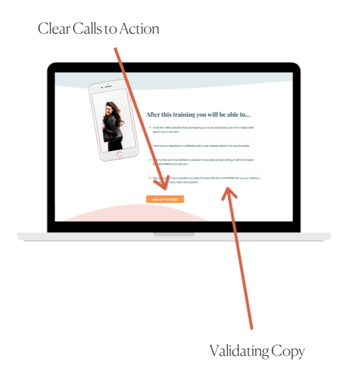
Number Four: Validating Copy
Use copy on your webinar registration page that tells people if it’s right for them — or not. Answer any potential questions the reader might have about what is covered in the webinar and what their takeaway will be.
The people interested in Laylee’s masterclass will know if it’s for them or not based on what she’s teaching. She clearly spells out what you’ll walk away with when you attend, inspiring her ideal customers to sign up.
Number Five: Your Branding & Images
Make sure your webinar registration page is on brand and representative of your business. If it doesn’t match the rest of your branding, people may not see it as legitimate! By using brand colors and matching imagery on your webinar registration page, people will be more likely to engage with it (aka, sign up for your webinar)!
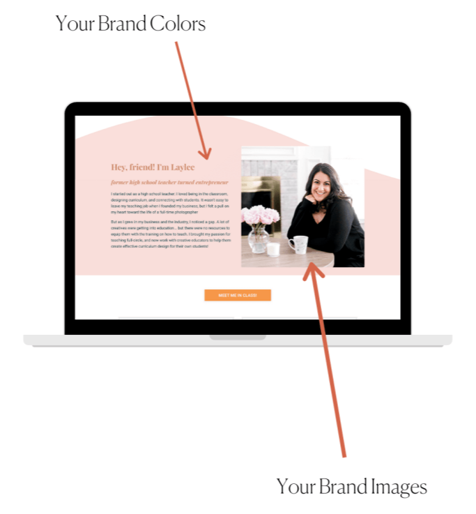
Laylee does an excellent job of this throughout her entire webinar registration page. She even goes above and beyond by introducing herself. By giving viewers a personal snapshot, she’s developing that know, like, and trust factor to increase conversions and, ultimately, sales.
Want to take an in-depth peek at Laylee’s webinar registration page? Check it out here!
Love Laylee’s registration page? Yours can look that good, too!
She used The Marie Webinar Funnel Kit to create her webinar registration page.
📌 Save for Later 📌